Enhance seller experience
B2C, web & app
2025
Senior Product Designer
LAUNCH IN JULY 2025
PROJECT
Empower sellers with an easy-to-use tool
Vestiaire Collective is the leading global online marketplace for desirable pre-loved fashion.
Vestiaire wants to improve seller engagement and increase the liquidity of listed products
ROLE
• UX Audit of the current experience
• Run user interviews and usability testing
• Benchmark of competitor
• Design vision and define MLP
GOAL
→ Rethink the seller experience to facilitate their journey.
→ Imagine a new tool that supports their needs and expectations across platforms
→ Review the foundation
→ Increase engagement with key actions : negotiations, price drops, campaign enrollments
Process
RESEARCH & INSIGHTS
Understanding the sellers'needs and problems
I conducted an in-depth analysis using Chattermill insights, identifying key pain points that affected seller engagement. In summary, sellers struggled with a lack of visibility on critical actions, inconsistent communication, and an absence of strategic alignment and prioritisation.
Recurring Seller Pain Points Identified:
→ Struggles with assortment management
→ Missed crucial actions, got lost in cluttered inboxes.
→ Lack of pricing control
→ Outdated web experience – Users found navigation unintuitive and the interface inconsistent across mobile and desktop.
→ Hard to find the best offers – No centralized way to track all received offers and take action.
"I have very often almost missed offers sent but found them by luck on my email account..."
" Its very hard for me to find inventory quickly.I have 300 items listed "
STRATEGIC DESIGN APPROACH
I designed both short-term and long-term solutions, allowing the team to envision future architectural changes and plan for incremental implementation.
→ Short term solution to be quickly implemented

• Implement a cohesive and responsive design across devices
• Adapt navigation and change UX copywriting
• Structuring "offer" component so it's scalable
→ Long-term vision to explore concept

• Redesign the seller's foundation
• Create a dashboard to give a quick overview of actions to take
• Setting a strategy regarding important action to take.
• Implement search and filtering features, along with better inventory to enhance visibility.
DESIGN SOLUTION
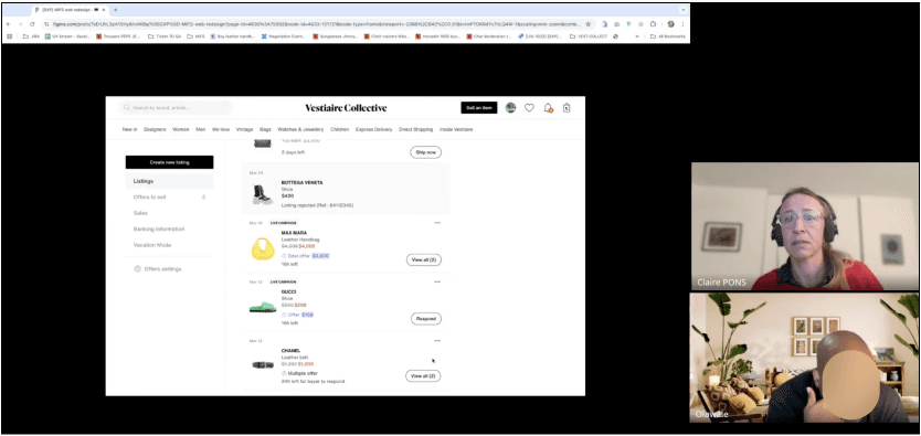
With a data-driven approach, I conducted a UX audit of the current experience to identify opportunities for improvement.
Enhancing web experience and prioritise actions
Ensuring web responsiveness, adhering to web standards, and integrating intuitive navigation

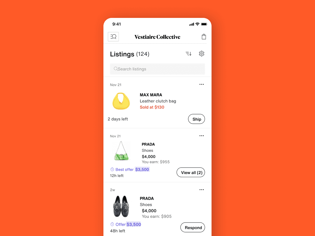
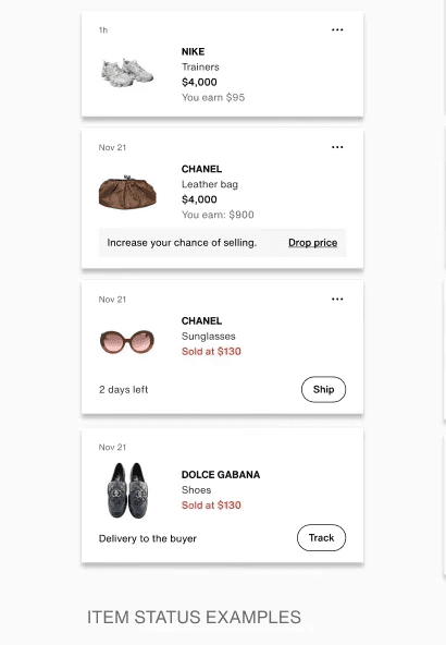
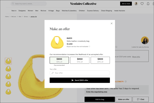
Redesigned Listing Page
→A clean, intuitive interface for managing listings and price adjustments.
→ Enhanced offer management – Clearer notifications for new offers with ranking based on best-to-worst bids.

Structuring flexible component


USER RESEARCH: UNEXPECTED FINDINGS!
I conducted moderated interviews with our target - US top sellers - to validate our concept and identify behaviour patterns using interactive prototypes.
The results were not as expected. The research revealed:
Data Misinterpretation – While we assumed web was crucial for sellers, interviews revealed that most sellers preferred using the mobile app for key actions.
Semi-Pro Sellers as the Core Audience – Semi-Pro sellers (those listing frequently but not as businesses) were the only segment needing enhanced catalog management tools.Misinterpretations of our data, as web usage was lower than initially assumed.
Web is primarily for listing, not managing sales – Most pricing & offer-related actions still happened on mobile.
As a result, we revised strategy based on findings and reprioritised team efforts by simplifying the short-term solution.
5. FINAL SOLUTION
While the original goal was to optimize the web experience, our research and testing redirected our focus toward mobile-first improvements and implement immediate UX fixes
→Simplified Profile Navigation
Access to all sections from the profile menu
→ Clear distinction between buying & selling sections for a more intuitive experience.
→ Quick-access menu for sellers to track and manage listings efficiently.

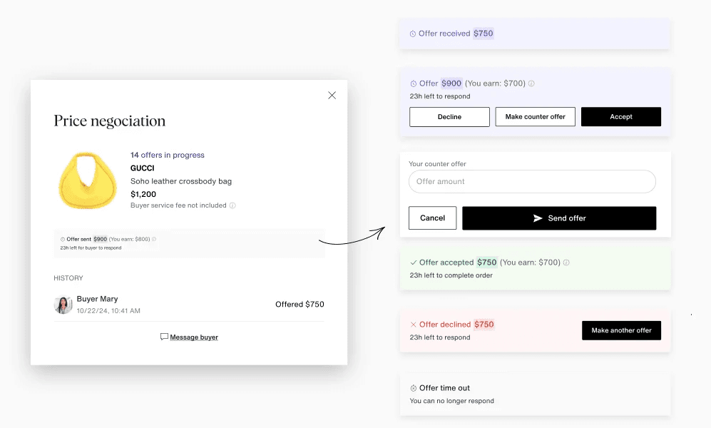
→Improved offers & negociations
Gathering all offers under one section
→ All received offers in one place – making it easier for sellers to compare and respond.
→ Better control over price drops – ensuring sellers can take action without accidental enrollments in campaigns
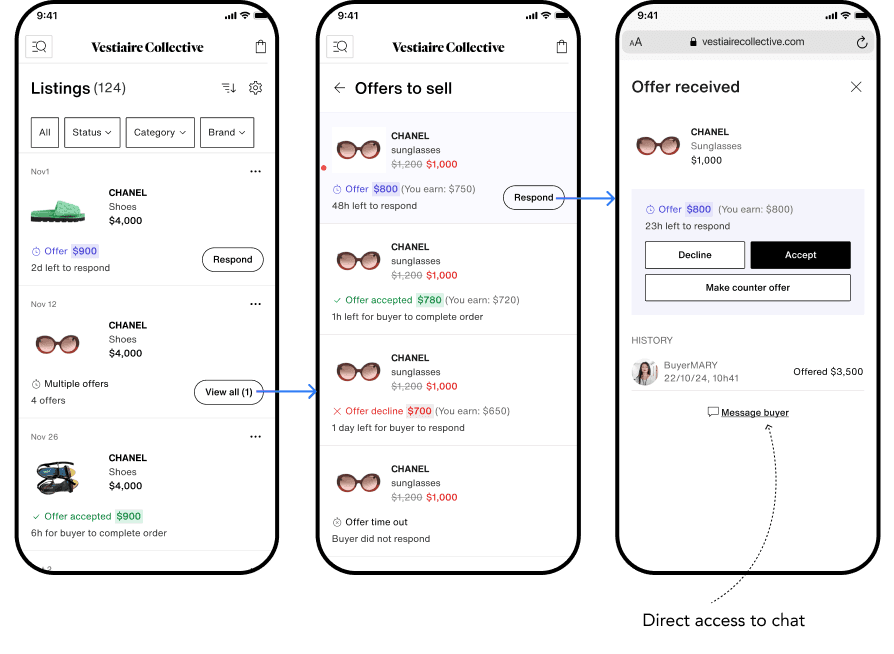
→Structuring flexible component
What i learned
• Data ≠ Truth
Just because analytics show web usage doesn’t mean users prefer it. Always validate with qualitative insights.
• Flexibility is Key
We pivoted our strategy based on real-world feedback, focusing on the highest impact areas.
• Prioritization is Everything
Identifying semi-pro sellers as a critical audience helped streamline our solution for the biggest business impact.